Insight article
Picture person?
Do you prefer pictures or words?
If anyone ever needed convincing that there are better ways to support a presentation than with powerpoint, then this film by the RSA might just do it. At 10-minutes long I know you’re thinking you don’t have time, but once it starts I challenge you to be able to stop it before you get to the end.
The film is about what motivates people at work, which in itself is an interesting subject, highlighting some of the things that can bring about real engagement… The kind of engagement that adds value to a business (more productive, innovative or proactive), as opposed to the kind that simply makes people happier at work (laudable though that may be).
The animation really brings the words to life and makes the presentation compelling. A lot of time and effort has obviously gone into the visual side – and it’s been rewarded with 750,000 hits on YouTube. Now it probably isn’t possible to create or use an animation like this every time there’s a presentation to be done, but it’s certainly possible to think about how the visuals that are being projected support the ideas – as opposed to simply bulleting lists of what’s being said. If it’s important that our audiences understand what we’re saying then we should be investing more time to the visual side of the communication? So many of us get our slides ‘done’ and then with 10 minutes to spare throw a memory stick at an exasperated designer…
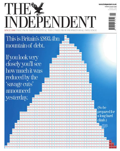
But we all know that people like to communicate in different ways and some ideas are simply better communicated through images. Apologies for bringing this post back to British politics, but… did anyone see the Independent image (below) about the deficit and the first round of spending cuts last week? It’s all very well talking about x billion this and x million cuts from there, but this great graphic certainly makes it clear how steep the mountain is that we have to climb – each little block represents £1bn… Oof.