Insight article
The beauty of restrictions
Professor Brian Cox, in his latest enthusiastic TV series The Human Universe, used an analogy for rules which really resonated with me in my galaxy of design.
He starts off by illustrating that the rules we currently know of the universe, and of Einstein’s theory of relativity—despite being highly complex—can be written on a single side of an A4 sheet of paper. He then goes on to use the wonderfully sedate world of cricket to show that despite the sport’s having a massive rule book, the game can still have infinitely different outcomes in each match. The rules allow for different outcomes depending on weather, energy levels of the bowler, the length of grass, etc. — all before even considering team strategy.
This got me excited and reminded me of why design is one of a myriad number of professions where restrictions don’t necessarily inhibit progressions. In other words, the existence of rules and complexity allows for greater flexibility and uniqueness. The more restrictions you have, the more you are pushed into thinking more creatively, and the outcome can be incredibly invigorating.
Tony Brook from Spin writes in the book Type Plus that “creativity always has and always will evolve, each era finding its own archetypal visual language. For me the most interesting aspect of such developments historically is when they are first being formed and the clichés, or accepted norms haven’t yet set in.”
After hundreds of years of using the same 26 letters, we are still experimenting with them and eking out more and more ways of working with these letter forms — which can still excite a seasoned world-leading designer in the form of Tony Brook.
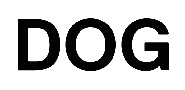
Later in the book, esteemed graphic designer and typography writer Yves Peters reminds me of a story I once came across about Dutch typeface designer Gerard Unger. He once proclaimed that “a word is worth a thousand images”. By way of example, he said that you could describe the entire canine subspecies – including all the hundreds of distinctive breeds – with three letters: D, O and G. This is such an incredibly succinct and more efficient way to evoke all these images than, say, setting up a photo shoot with the entire cast of Crufts or commissioning an illustrator to draw fur upon fur for days on end.
When you look at world of type design, reminding yourself of the restrictions of 26 letters, this is where each and every typeface can really revel in its own identity and form its own personality. An effective typeface contributes to the context in which it sits and creates a really exciting and relevant piece of communication.